Marketing automation
This page provides a deep dive into the content strategy work I completed for the launch of Mailchimp’s Customer Journey feature.
Overview:
Naming & terminology
Developing the content model
UX copy exploration
Naming
After running terminology workshops and sitting in on interviews with market focus groups, we decided to name this new automation tool Customer Journey. What users found most appealing during testing was the ability to visually map the interactions they want to have with their customers.
While Customer Journey was an appropriate name for the product and the output of what a user creates, I identified the need for a term that would refer to the internal visualization that customers build in Mailchimp.
The concept of a journey map made it easier to talk about the input and output of an automated journey. The map is the piece that a user has control over, that a customer can trigger and enter. The journey is the route a customer takes as the result of that map.
Developing the content model
What’s particularly challenging about this tool from a user’s perspective is that there isn’t a linear, guided building process. Users are presented with a blank canvas and a side panel divided into actions and rules, which they need to drag into the map and configure.
In my interaction model for the tool, the side panel is key to the experience.
It’s meant to convey the user’s perspective of building—that’s why the action blocks say Send email and Add or remove tag. But when a block is dragged into the map on the right, the copy changes to reflect what a user’s customer will experience.
Another element of the map that helps users understand what their customers are experiencing are the starting, progressive, and exit sentences that appear as users configure blocks in their map.
These short lines of copy that appear above the blocks start a sentence, then the first line within each block completes the short line of copy above it. When the map is viewed as a whole, the copy should tell a user the story of a customer’s journey.
UX copy exploration
Empty state
This empty state is what users will see when they first enter the builder. It explains starting points and their relationship to a Customer Journey.
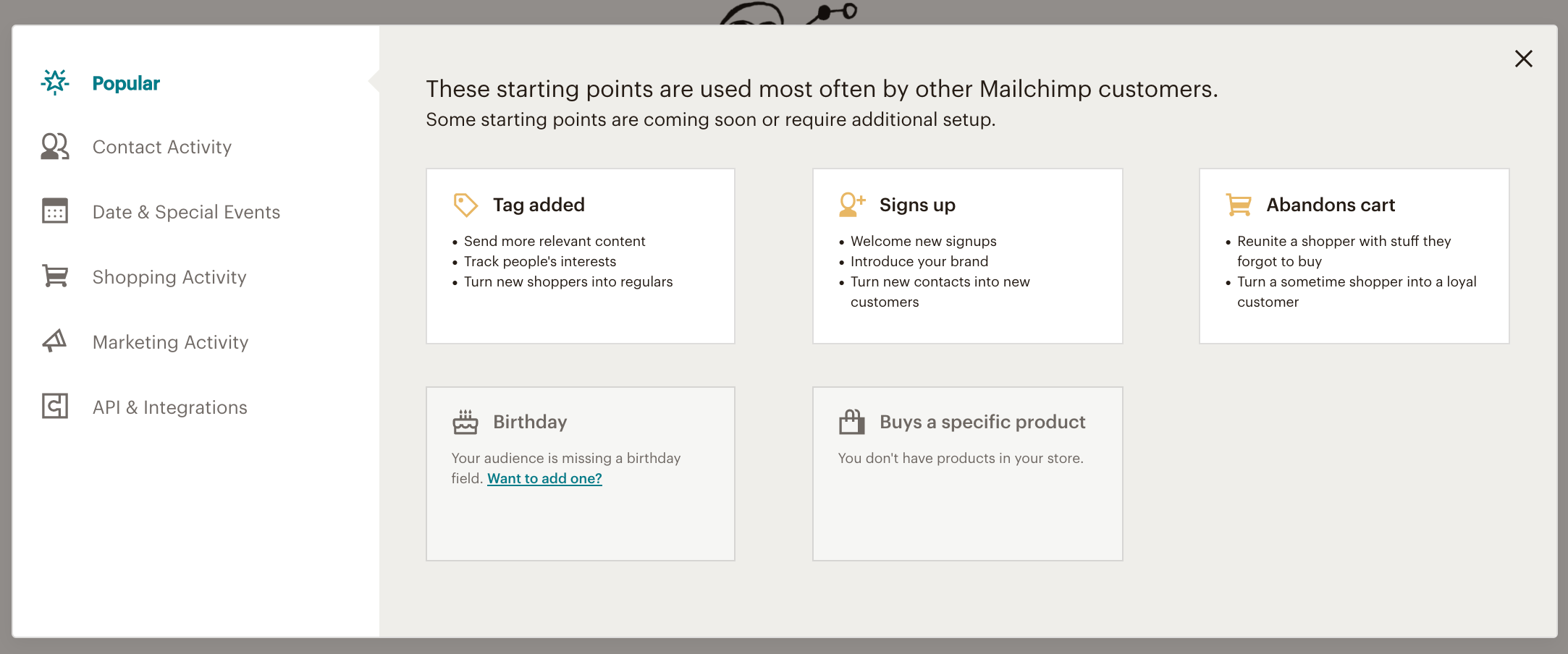
Starting point selection
The starting point selection modal needs to convey a lot of information to a user without overwhelming them. First, depending on the category a user selects on the left, the copy at the top needs to explain what’s unique about a group of starting points and why some are unavailable.
If a starting point is available for a user to pick right away, they'll see a bulleted list of use cases. If it’s not available, the user will see messaging that indicates why.
Pausing an active journey map
Users need to pause a journey map in order to edit it, but it will also prevent new contacts from entering while it’s paused.
Product tour
To help introduce users to the different elements of the builder and increase activations, I worked on copy for an in-app product tour to inform users about what they need to build a map.


